Building iOS Web Apps
Web Inspector
Remote debugging web applications is available since iOS6. With remote debugging it is easy to check and alter the rendered CSS and test the functionality of your app on the device itself. Instead of Safari I recommend you to use the latest Nightly WebKit, which has more features and a better interface. Changes to WebKit’s developer tools since Safari 6 can be found here.
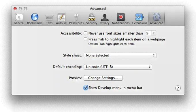
To enable developer tools on your computer go to Preferences > Advanced in Webkit/Safari and check the box next to “Show Develop menu in menu bar”.
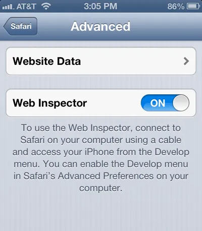
On your mobile device go to Settings > Safari > Advanced and toggle the Web Inspector there.
Afterwards you can connect the device with your computer using a cable. If you have opened a website on mobile Safari, its desktop counterpart should now list your device in its develop menu including your open tabs. Clicking on one of these should open the developer tools for the selected website.
Local Web Server
While developing your application it is useful to see changes instantly and without the need of a server. That’s why I recommend you to install and start MAMP. This application allows you to choose a folder, which will be displayed at http://localhost and at your IP address on mobile devices if they are in the same wireless network as your computer. To find your computer’s IP go to System Preferences > Network. It will probably look like 192.168.0.X therefore you should be able to open the web app from your device at http://192.168.0.X. For instant updates when saving a file you can use tools like LiveReload.
Hiding Safari’s chrome
Users have always the ability to add websites to their homescreen, but If you want to hide Safari’s chrome after they have added yours, you need to include this meta tag:
<meta name="apple-mobile-web-app-capable" content="yes" />Zooming and Viewports
On websites users may pinch to zoom at anytime anywhere, but this shouldn’t be possible for web apps in most cases. This meta tag disables zooming with gestures and sets the viewport to its “default” value:
<meta name="viewport" content="user-scalable=no, initial-scale=1" />I have to admit that “default value” is not quite right as viewport is a larger topic, but you can read more about it on Apple’s Safari Web Content Guide.
Status bar options
The status bar above your web app is black by default on iOS6. You may change this to black translucent, but keep in mind that this will add 20px and 40px on retina screens respectively to your app’s height.
<meta
  name="apple-mobile-web-app-status-bar-style"
  content="black-translucent"
/>
Your app’s name
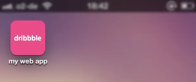
If a user wants to add your site to his homescreen, Safari uses the webpage’s title as a suggestion for the name of your web app. Since iOS6 you can suggest another name:
<meta name="apple-mobile-web-app-title" content="My Web App" />In both cases it is just a proposal and users will always be able to define another name.
Icon sizes
By default iOS uses a screenshot of your website as icon for the web app. You can set your own by appending a link tag to your website with the rel attribute of apple-touch-icon. As there are different screen resolutions across Apple’s devices you can define an icon for each of them, but iOS is also able to scale icons down (or even up). This means you can define an icon for the retina iPad, which has the size of 144x144 pixels and it will work on every other device for example an iPhone 3G. I prefer defining one icon for each retina device and leave standard displays behind as retina will be everywhere. So if your web app will work on both iPhone and iPad, make and include both in retina sizes. If it’s intended to work on iPhone only like doubbble, include just the retina iPhone icon. To tell iOS which icon it should use if both options are available, give it a hint with the sizes attribute. Example:
<!-- iPhone Retina -->
<link
  rel="apple-touch-icon-precomposed"
  sizes="114x114"
  href="apple-touch-icon-114x114-precomposed.png"
/>

<!-- iPad Retina -->
<link
  rel="apple-touch-icon-precomposed"
  sizes="144x144"
  href="apple-touch-icon-144x144-precomposed.png"
/>
You may leave out the link tags if your icons are stored in your website’s root directory and start with apple-touch-icon-, but as there are some Android devices using theses tags too, it is possible that it won’t work for them. In the example I’ve also added precomposed to the icon’s name and the rel attribute of the link tag. This tells iOS not to overlay its default glossy gradient over your icons. For further information about naming conventions have a look at Apple’s Guide.
Startup image
As for native apps you have the ability to display an image when the user starts your web app. doubbble for example displays an image of its initial screen so that the first start of the app feels much faster. A startup image is always the size of the device’s resolution minus the status bar. iPads can have one startup image for portrait mode and one for landscape mode whereas iPhone web apps will always start in portrait mode. Furthermore iOS doesn’t scale startup images. You have to include images for every device you support with the correct dimensions to work. Additionally startup images in landscape mode have to be saved in portrait mode rotated 90 degrees clockwise. According to the media attribute of the link tags iOS applies the matching image. A full list with every possible startup image definition can be found on this gist. The code is pretty heavy if you support a broad range of devices, but it’s easy and short if you just support iPhone 5 and iPhone 4 for example:
<!-- iPhone 4 -->
<link
  rel="apple-touch-startup-image"
  href="images/iphone4.png"
  media="(device-height:480px)"
/>

<!-- iPhone 5 -->
<link
  rel="apple-touch-startup-image"
  href="images/iphone5.png"
  media="(device-height:568px)"
/>
Image dimension of startup images for iPhone 4/4S is 640x920 and for iPhone 5 it’s 640x1096.
Writing the first lines
Taking everything into account I have written an index.html for the dribbble feed viewer:
<!DOCTYPE html>
<html>
  <head>
    <meta charset="utf-8" />
    <meta name="viewport" content="user-scalable=no,initial-scale=1" />
    <meta name="apple-mobile-web-app-capable" content="yes" />
    <meta name="apple-mobile-web-app-title" content="my web app" />
    <link
      rel="apple-touch-icon-precomposed"
      href="apple-touch-icon-114x114-precomposed.png"
    />
    <link
      rel="apple-touch-startup-image"
      href="images/iphone4.png"
      media="(device-height:480px)"
    />
    <link
      rel="apple-touch-startup-image"
      href="images/iphone5.png"
      media="(device-height:568px)"
    />
    <title>Install dribbble feed viewer</title>
  </head>
  <body>
    <h1>Welcome buddy!</h1>
    <p>Add this site to your homescreen to install the dribbble feed viewer.</p>
  </body>
</html>
I have uploaded the complete code with images to github. After adding this site to your homescreen it should look like this: