How to create a highlighter marker effect in CSS
The yellow background of a marker pen is for some reason the most appealing way to highlight important parts in text. I already implemented this effect a couple of times, but wanted to find the best solution of achieving it with pure CSS for my new website.
Basecamp uses a similar effect on their website, but there was still room for improvement to make it look more realistic and to avoid cutting off the effect.
Since you might be viewing my website in dark mode, where highlighted text is rendered in a different way, here is a screenshot of the final result:
CSS Code
mark {
  margin: 0 -0.4em;
  padding: 0.1em 0.4em;
  border-radius: 0.8em 0.3em;
  background: transparent;
  background-image: linear-gradient(
    to right,
    rgba(255, 225, 0, 0.1),
    rgba(255, 225, 0, 0.7) 4%,
    rgba(255, 225, 0, 0.3)
  );
  -webkit-box-decoration-break: clone;
  box-decoration-break: clone;
}
If you want to highlight text, you should use the <mark> HTML element to do it in a semantically correct way. It was created for this purpose and already has a default browser style, which adds a yellow background color behind the text.
How it works
You can copy and paste the code above to achieve the effect. If you want to know how it works, I’ll go into the details below.
Negative margin
The first two lines of margin and padding make sure that the highlighting background extends a little bit beyond the word itself. This let’s it look more natural and appealing. Sometimes it even touches the edges of the words next to it, like it might happen when annotating text with a pen.
If you want to reduce this overdrawing effect, you can change the second number used in padding and margin. In the code above it’s set to 0.4em. Just make sure to have the same value for both and to use the negative value in margin, so that no additional space is added around the element.
Uneven border-radius
The border-radius value creates the effect of one edge being rounder than the other. This again makes it look more like it was highlighted by a pen since one doesn’t always hold the pen perfectly while marking a word.
Gradients in background
The next two lines have the biggest effect. The first line resets the background to remove the default color from the <mark> element. This could be done by using background-color as well.
The second line is setting the background-image to a gradient. It starts with a low opacity (30%), goes to a high opacity (70%) and then goes to an even lower one (10%).
This creates the effect of less color being applied at the end, which would happen when using a real pen.
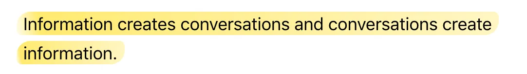
Fixing multi-line behaviour
The last two properties are important to fix the effect being applied across multiple lines. Without box-decoration-break: clone; the effect gets cut off at the begining and end of new lines:
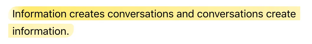
Just for comparison here is how it looks like with the property again:
This and the negative margin effect were missing from the highlighting code that Basecamp uses.
Conclusion
This is the most realistic effect that can be achieved with pure CSS as far as I know. In the future we’ll probably see some really good looking alternatives that leverage CSS Houdini, but these will also come with a cost (kilobytes).
If you have any further improvements, let me know!
Did you find this useful? You could vote for my answer on stackoverflow to help others. :)